Portafolio de Páginas Web
Diseño Web Profesional
7 Powerful Reasons to
ADOPT DARK MODE IN WEB DESIGN
In recent years, dark mode in web design has evolved from a simple curiosity into one of the most widely adopted trends by designers and developers. It’s not just an aesthetic choice—this mode enhances readability in low-light environments, reduces visual fatigue, and even optimizes energy consumption on certain devices.
This article explores 7 key reasons why dark mode is more than just a fad. It can significantly improve your users’ digital experience, with examples, data, and professional implementation strategies.
1-Evolution and Rise of Dark Mode in Web Design
The rise of dark mode is no coincidence. It has been driven by a combination of modern aesthetics, the demand for personalized experiences, and native support in operating systems and browsers.
Origin in Software Interfaces
The concept of dark mode emerged in the computing world of the 1980s, when monochrome screens displayed green or amber text on a black background. With the arrival of graphical interfaces, white backgrounds became standard, but in recent years black has made a strong comeback thanks to productivity apps and social media.
Expansion to Websites and Digital Platforms
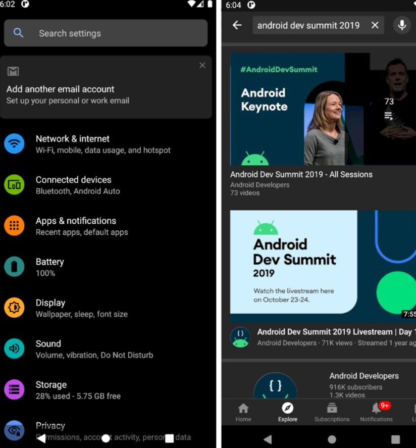
Today, platforms like Twitter (now X), YouTube, and GitHub offer dark mode by default or as an option. This transition from apps to websites is due to users increasingly expecting control over their visual experience, regardless of the device.

2-Modern and Minimalist Aesthetics
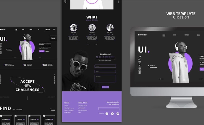
Dark mode in web design brings an elegant and sophisticated style. It highlights key elements and facilitates clean, streamlined layouts—perfect for brands aiming to project modernity.
Colors and Typography in Dark Mode
The key lies in using balanced contrasts: white or light gray typography over dark backgrounds, and color accents to emphasize buttons or calls to action.
Using Contrast to Draw Attention
In a dark environment, any colorful element stands out more vividly. This makes it easier to guide the user’s eye toward the most important parts of the content.
3-Improved Readability in Low-Light Environments
One of the most cited benefits is that dark mode reduces glare and makes reading easier in dimly lit environments.
Perception of Text on Dark Backgrounds
In low-light conditions, white backgrounds can be uncomfortable, causing discomfort and eye strain. A dark background, on the other hand, reduces the amount of emitted light.
Use Cases in Adaptive Design
Reading apps, software for programmers, and streaming platforms benefit greatly, as they allow for long sessions without visual discomfort.

4-Reduced Eye Strain
Impact on Long-Term Users
Professionals who spend hours in front of a screen—such as programmers, designers, or writers—find in dark mode an ally to reduce ocular tension.
Comparison with Light Mode
Visual ergonomics studies show that while light mode works best in well-lit environments, dark mode offers advantages in low or medium-light situations.
5-Optimized Energy Consumption on OLED Screens
Dark mode in web design also provides a technical benefit: it reduces power consumption on OLED and AMOLED screens, which are common in smartphones.
Battery Savings on Mobile Devices
On these screens, black pixels are turned off, meaning less energy is used.
Application in Monitors and Laptops
Although the savings are smaller on LCD screens, modern laptops with OLED displays see a noticeable effect, extending battery life.
6-Personalization and Accessibility
Dark mode is not just about style—it’s also about web accessibility.
Adjustments for Visual Needs
People with photophobia or certain visual conditions can greatly benefit from a dark background, as it reduces brightness and excessive contrast.
Integration with Web Accessibility (WCAG)
The WCAG guidelines recommend offering high-contrast options, something that can be effectively achieved with a well-designed dark mode.
7-Strategies for Implementing Dark Mode on a Website
Adopting dark mode is not just about changing colors—it involves technical and user experience decisions.
Using CSS and Color Variables
Using CSS variables (custom properties) allows for dynamic color scheme changes and consistency across the entire interface.
Automatic Dark Mode vs. Manual Toggle
Some sites automatically enable dark mode based on system settings, while others offer a button for the user to decide.
Ideally, both options should be available.

Challenges, Disadvantages, and Examples of Sites That Use It
Challenges, Drawbacks, and Examples of Sites Using It
Challenges and Drawbacks of Dark Mode
Although it offers many benefits, it’s not always the best choice in every context.
Readability in Sunlight
In very bright environments, contrast can make reading harder and may require increasing brightness, which negates energy savings.
Possible Contrast Errors
Poor color choices can lead to illegible text, especially for users with visual impairments.
Examples of Brands Successfully Using Dark Mode
Social Media
Twitter/X, Instagram, and TikTok have implemented dark mode as a basic configuration option.
Streaming Platforms
Netflix, YouTube, and Spotify use it as the default mode to reduce eye strain during long viewing sessions.
Conclusion
Dark mode in web design is not just a passing trend—it’s a response to real needs for visual ergonomics, modern aesthetics, and personalization.
Its adoption will continue to grow, and websites that implement it well will offer a more comfortable and attractive experience for their users.

